

The Hidden Risks of Misleading Numbers in the News
Numbers give headlines weight, but when they’re presented poorly they can do more harm than good. From overstated percentages to cherry‑picked data, misleading statistics erode trust, fuel division, and push people toward bad decisions—whether it’s a health choice or a vote. Below are the most common ways the press gets its math wrong, concrete (hypothetical) examples, and a deeper dive into why each mistake matters.
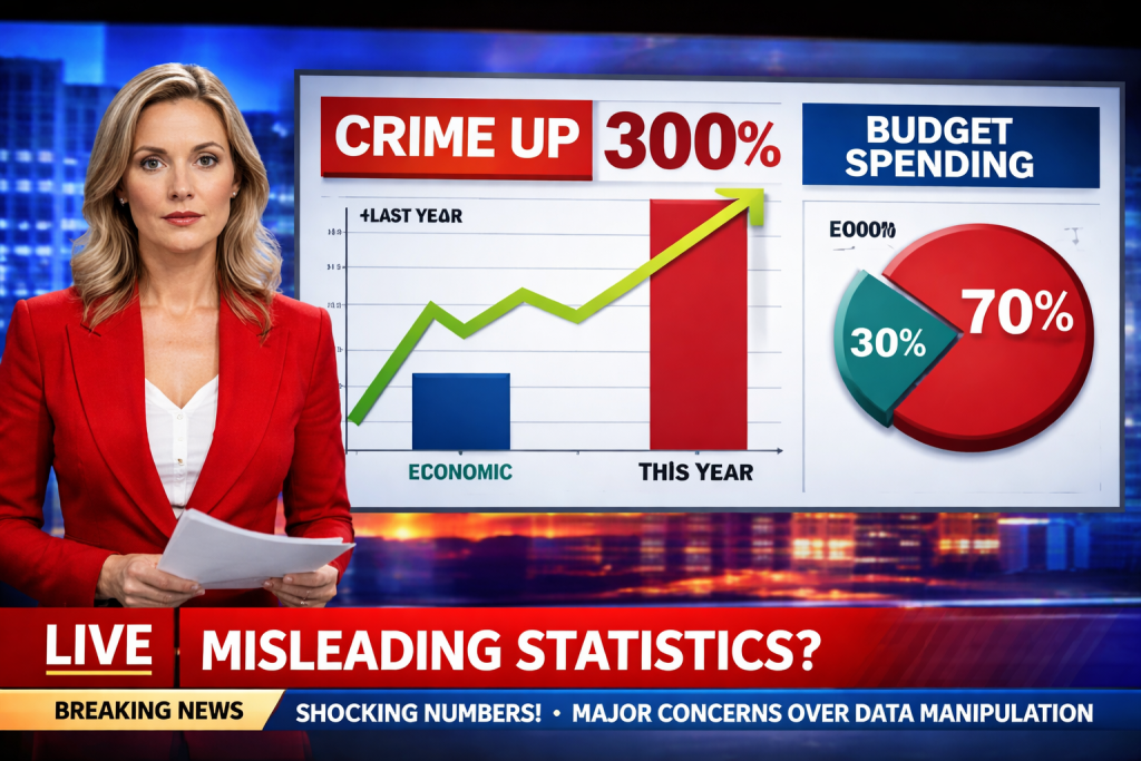
This posting includes formulas that some might find complex, but the basic items listed should still offer some valuable insights.
- Picking Only the Good Bits (Cherry‑Picking)
Example headline: “Crime falls 30 % in City X after the new policing plan.”
Why it’s wrong (expanded):
Selective timeframe: The article shows only the first three months of 2024, a period when a temporary crackdown reduced petty offenses. During the same three‑month window in 2023, violent assaults actually rose by 15 %. By ignoring the previous year’s data, the story hides a crucial counter‑trend.
Misleading trend inference: Readers infer a sustained downward trajectory, yet the data set is too narrow to support that conclusion. Long‑term trends require multiple years of comparable data points; otherwise, short‑term fluctuations are mistaken for lasting change.
Policy implications: Decision‑makers might allocate resources based on an incomplete picture, reinforcing strategies that don’t address the underlying problem.
- Inflated Percentages (Relative Change Without Absolute Context)
Example headline: “New diet cuts heart‑disease risk by 80 %.”
Why it’s wrong (expanded):
Baseline matters: The study started with a baseline risk of 0.6 % (six cases per 1,000 people). An 80 % relative reduction brings the risk down to 0.12 %—a difference of only 0.48 % in absolute terms. Most readers interpret “80 %” as a massive health breakthrough, overlooking that the absolute benefit is less than half a percent.
Sample size distortion: The trial involved 20 participants on the diet and 20 controls. Small samples inflate variability; a single additional event can swing the percentage dramatically. Larger, randomized trials often produce more modest relative reductions.
Decision bias: Physicians and patients may overvalue the diet, diverting attention from interventions with larger absolute benefits (e.g., blood‑pressure control, smoking cessation).
2. Too Few Voices (Small Sample Size)
Example headline:
“Poll of 150 voters predicts Candidate A will win with 60% of the vote.”
Why this headline is misleading (with the math explained):
- Large margin of error
- The poll reports that 60 percent of respondents support Candidate A. This is the observed proportion—the share of people in the poll who chose that candidate.
- Because the poll surveys only 150 people, not every voter, the result is uncertain. We measure this uncertainty using the standard error, which estimates how much the result would vary if the poll were repeated many times with different random samples.
- The standard error is calculated as:
- Square root of (p × (1 − p) ÷ n)
- Where:
- p = observed proportion (0.60)
- 1 − p = proportion not supporting Candidate A (0.40)
- n = number of respondents (150)
- Plugging in the numbers:
- Square root of (0.6 × 0.4 ÷ 150)
- = Square root of (0.24 ÷ 150)
- = Square root of 0.0016
- ≈ 0.04, or 4 percent
- Calculating the 95 percent confidence interval
- A confidence interval gives a range of values that likely contains the true level of support in the full voting population.
- For a 95 percent confidence level, we multiply the standard error by 1.96:
- 4 percent × 1.96 ≈ 8 percent
- We then add and subtract this margin from the reported result:
- Lower bound: 60 percent − 8 percent = 52 percent
- Upper bound: 60 percent + 8 percent = 68 percent
- 95 percent confidence interval: 52 percent to 68 percent
- This means that, based on this poll, Candidate A’s true support could reasonably fall anywhere within that range. A headline that presents “60 percent” as a firm prediction hides this uncertainty and makes the race appear more decisive than the data justify.
- Risk of sampling bias
- All of these calculations assume the sample represents the broader electorate. If the poll relied on a convenience sample, such as online volunteers, certain groups may be over-represented while others are under-represented. In that case, even the confidence interval may be misleading. More reliable polls use methods like random-digit dialing or stratified sampling to better reflect the population being studied.
- Over-interpretation of results
- A single poll with a small sample size is only a noisy snapshot, not a forecast. Treating it as definitive can mislead readers and influence campaign donations, voter enthusiasm, and media coverage despite the substantial uncertainty.
- Confusing Correlation with Cause (Causal Fallacy)
Example headline: “Ice‑cream sales rise alongside shark attacks—maybe eating ice‑cream makes you a target?”
Why it’s wrong (expanded):
Hidden confounder: Both ice‑cream consumption and beach attendance surge in summer months. More people in the water naturally increase the chance of shark encounters, while hotter weather drives higher ice‑cream sales. The common variable (season) explains the parallel rise.
Spurious correlation: Statistical correlation (r ≈ 0.7) does not imply a mechanistic link. Without controlling for the confounding factor, any causal claim is unfounded.
Public perception: Such sensationalist links can create irrational fears (e.g., avoiding ice‑cream) and distract from genuine preventive measures (e.g., beach safety protocols).
- Ignoring the Base Rate (Base‑Rate Neglect)
Example headline: “New rapid test catches 95 % of COVID‑19 cases—if you test negative, you’re safe.”
Why it’s wrong (expanded):
Prevalence Effect:
Suppose the community prevalence of COVID-19 is 1% (i.e., 10 out of every 1,000 people are infected). Even with a test that has 95% sensitivity and 98% specificity, the Negative Predictive Value (NPV) is about 99.5%. This means that if you test negative, there’s a 99.5% chance you do not have COVID-19.
The NPV can be calculated using the formula:NPV=True Negatives+False NegativesTrue Negatives
Where:
- True Negatives (TN) are the individuals who are not infected and test negative.
- False Negatives (FN) are the individuals who are infected but test negative.
In terms of sensitivity (Sens), specificity (Spec), and prevalence (Prev), the NPV formula becomes:NPV=(1−Prev)×Spec+Prev×(1−Sens)(1−Prev)×Spec
Let’s plug in the values for the test:
- Prevalence (Prev – know or estimate) = 0.01 (1% of people are infected).
- Sensitivity (Sens) = 0.95 (95% of actual cases are identified).
- Formula for Sensitivity:
- True Positives (TP) are people who are infected and test positive.
- False Negatives (FN) are people who are infected but test negative.
- Formula for Sensitivity:
- Specificity (Spec – must know beforehand) = 0.98 (98% of non-cases are correctly identified).
Now, calculate the NPV:NPV=(1−0.01)×0.98+0.01×(1−0.95)(1−0.01)×0.98 NPV=0.99×0.98+0.01×0.050.99×0.98 NPV=0.9702+0.00050.9702=0.97070.9702≈0.9995
So, the NPV is approximately 99.95%, meaning that if you test negative, there’s a 99.95% chance that you do not have COVID-19. However, this does not guarantee that all negative results are accurate.
Even in a low-prevalence setting (1%), there are still about 5 false negatives out of every 1,000 negative results, which means some infected individuals will be missed by the test.
False Reassurance:
While the NPV of 99.95% sounds high, the absolute number of missed cases is still significant in a low-prevalence setting. For instance, with a 1% prevalence (10 infected individuals per 1,000), about 5 out of 1,000 people who test negative are actually infected. As a result, people who test negative may mistakenly assume they are completely safe and abandon important protective behaviors, like masking or distancing. This false reassurance can unintentionally increase the risk of transmission.
Clinical Decision-Making:
For accurate interpretation of test results, physicians need to consider sensitivity, specificity, and the prevalence of the disease in the population (do they even understand these concepts?).
The NPV is highly dependent on prevalence, and headlines that ignore base rates (e.g., “Test catches 95% of cases”) can give a skewed sense of certainty about a negative test result. Without understanding the base rate, the public and even medical professionals may misinterpret the test results, potentially leading to incorrect clinical decisions.
Key Takeaways:
- NPV is influenced by Prevalence: Even with a high NPV (99.5%), the absolute number of false negatives can still be significant when disease prevalence is low.
- Formula Context: The NPV formula helps illustrate how specificity, sensitivity, and prevalence interact in real-world scenarios, influencing test reliability.
- Real-World Impact: The false reassurance from a negative result can lead to risky behavior, especially in low-prevalence areas, where the test still misses a small percentage of actual cases.
- Misusing Averages (Mean vs. Median)
Example headline: “Teachers earn an average salary of $70,000, matching engineers.”
Why it’s wrong (expanded):
Skewed distribution: Teacher salaries are heavily right‑skewed because a small number of administrators, department heads, or teachers in affluent districts earn substantially more. Those outliers raise the arithmetic mean.
Median as a better indicator: The median salary—where half earn more and half earn less—is approximately $45,000, reflecting the typical teacher’s earnings. Using the mean masks the financial reality for the majority.
Policy consequences: Legislators may underestimate the need for salary reforms if they rely on the inflated average, perpetuating inequities in education funding.
- Tricky Graphs (Manipulated Scales)
Example visual: Bar chart of unemployment rates where the y‑axis starts at 4 % instead of 0 %.
Why it’s wrong (expanded):
Visual exaggeration: A 0.5 % increase (from 4.0 % to 4.5 %) appears as a towering bar when the axis is truncated, implying a dramatic economic downturn. In reality, the change is modest and within normal monthly fluctuation.
Perception bias: Human brains interpret length proportionally; a compressed baseline inflates perceived differences. This can provoke unnecessary panic or political pressure.
Best practice: Graphs should start at zero (or clearly label any deviation) to preserve proportional integrity and allow readers to gauge true magnitude.
There have also been graphs with two lines where each line came from a different set of axes (on separate graphs, combined in one graph to confuse). The effect was to misstate what was actually happening for political motives. When the two-line graph used the same axes for both lines (as you would need to actually do!), the misleading conclusions from the original graph were nowhere in sight.
- Overstating Statistical Significance (P‑Value Misinterpretation)
Example headline: “Breakthrough drug proven to speed healing!” (Study reports p = 0.06).
Why it’s wrong (expanded):
First of all, including information like this, including a “p-value” can only confuse people (the desired result?) who do not have statistical and hypothesis testing experience.
Arbitrary threshold: The conventional cutoff for “statistical significance” is p < 0.05. A p‑value of 0.06 indicates a 6 % probability that the observed effect is due to random chance—still relatively high.
Risk of Type I error: Declaring a finding “significant” when it doesn’t meet the threshold increases the likelihood of false positives, leading to premature adoption of ineffective or unsafe treatments. Type I error: Rejecting a true null hypothesis.
The p-value is similar but it’s the probability of observing data at least as extreme as what we observed, assuming the null hypothesis is true. When the p-value is less than 0.05, we typically reject the null hypothesis.
Context matters: Researchers sometimes report “trend‑level” findings, but headlines that ignore the nuance mislead the public and clinicians alike.
—
Why These Mistakes Matter
Each slip can sway public opinion, affect voting patterns, and alter health behaviors. When people act on distorted data—whether backing a flawed policy, skipping a beneficial treatment, or spreading unnecessary fear—the whole society suffers. Repeated exposure to shaky stats also breeds cynicism, making audiences dismiss even solid reporting.
Building Better Media Literacy
To protect yourself from these pitfalls, try the following:
Seek the original source – Locate the study, dataset, or official report behind the claim.
Demand context – Look for absolute numbers, sample sizes, confidence intervals, and the time frame covered.
Read graphs critically – Verify axis origins, scaling, and whether data points are aggregated or disaggregated.
Question causality – Ask whether a plausible third variable could explain a correlation.
Compare averages – When possible, ask for median or percentile figures to gauge distribution shape.
Check statistical thresholds – Understand what p‑values, confidence levels, and margins of error actually signify.
Conclusion
Good journalism relies on the integrity of data, yet far too often, statistics and graphs are intentionally distorted to push a particular agenda. Numbers are selectively cherry-picked, axes are manipulated, and trends are exaggerated—deliberate tactics designed to mislead and sway public opinion. This isn’t just careless reporting; it’s a calculated strategy to manipulate perception and control decision-making. In a world where data is weaponized to distort reality, the public’s trust in numbers is systematically eroded, and with it, our ability to make informed, rational decisions.
To combat these issues, we must demand better—not only from the media but from ourselves. Critical thinking isn’t just a passive response; it’s an active, ongoing defense against those who weaponize statistics for manipulation. Skepticism, when applied to data, is not an attack on the truth—it’s a safeguard against the misuse of information. The media must be held accountable, not only for the facts they report but for how they present them. Sadly, many outlets lack a deep understanding of the data they disseminate, blindly passing along numbers that are often misleading or incomplete. This makes us, the consumers, responsible for being the final check on the truth.
We must not only question the numbers we see but also demand transparency in how those numbers were gathered and analyzed. When statistics are presented to us, we must ask: Who benefits from this narrative? What’s being left out? How were the data collected? These are the critical questions that will reveal when statistics are being used to manipulate, rather than inform.
Let’s try to raise the bar for accuracy and transparency and take back control from those who distort data for power or profit. Then can we use statistics as they were meant to be used: not as a tool for manipulation, but as a means of clarity, understanding, and making decisions grounded in truth.
—
Please read our disclaimer on our home page.